John Hopkins COVID-19 map
recommended
Interactive Map
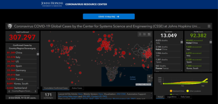
You’ve probably noticed that the map has been evolving along with the virus. Now, it sports new layers of data—including a close-up section on the US, with details on testing, hospitalizations, and country-level demographic data.
The map provides “more nuance on what’s happening to support decision-making.
For example, the new details can help prepare hospitals to better anticipate staffing and resource shortages