Filter
338
Text search:
infographic
Featured
53
71
Language
Document type
115
102
29
29
18
16
8
7
6
5
2
1
Countries
16
14
11
10
6
5
5
4
4
3
3
3
3
3
3
3
3
2
2
2
2
2
2
2
2
2
2
2
2
2
2
2
2
2
2
2
2
2
2
1
1
1
1
1
1
1
1
1
1
1
1
1
1
1
1
1
1
1
1
1
1
1
1
1
1
1
1
1
1
Authors & Publishers
Publication Years
Category
95
26
23
7
4
4
2
Toolboxes
86
30
22
16
15
14
13
13
11
10
10
10
10
8
7
5
4
4
3
3
1
1
1
x7 infographics

Information from the NHS and WHO.
Made by Cambridge Medics and Researchers.
Updated: 18.02.2020
Accessed: 27.03.2020
Accessed: 27.03.2020
Updated: 12.02.2020
Accessed: 29.03.2020
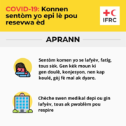
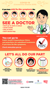
A poster in Creole detailing the symptoms of COVID-19 and when to get medical help.
Poster for communities and health worker
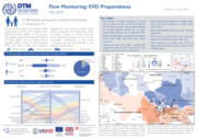
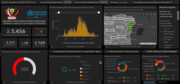
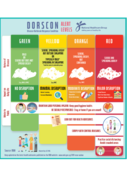
Ebola dashboard RDC (EVD dashboard)
recommended
The WHO/AFRO Ebola dashboard has the most up to date numbers available.
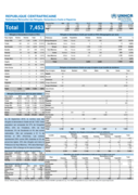
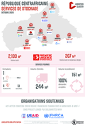
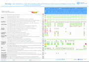
Au 30 Septembre 2019, le nombre total des réfugiés et demandeurs d'asile est de 7,453. Cette population est composée de 37% de Congolais (RDC), 23% de Tchadiens, 30% de Sud Soudanais, 5% de Soudanais et 4% des autres nationalités. Elle est composée à 51 % de femmes et 49% d'hommes. Les enfants
...
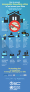
This initiative produced over 55 infographics designs in over 60 languages in order to empower many communities in Africa and beyond.
The infographics are available in over 60 languages, including: Amhari, Bemba, Chinchewa, English, Hausa, Igbo, Luganda, Lumasaba, Madinka, Pidgin, Portuguese, Se
...